

Mastering ‘Visual Language’ in Interiors
The type of interiors I create are usually in historic buildings, layered with colour and variety, weaving together the narrative my clients bring with the character of the architecture. Each element may come from a different place or moment, but it still needs to relate to the whole rather than compete with it, and there’s one principle I rely on to bring it together.
At the end of a consultation I might have a Design Brief that includes:
Georgian architecture
Rugged rural ‘genius loci’ (the spirit of the surroundings)
Childhood memories of grandma’s house
Influences from a favourite hotel
Bold personal taste
A collection of modern artwork
Differing preferences between partners
Dog-friendly durability
One of the most valuable skills I bring to my clients is the ability to pull this together without it looking like a dog’s dinner! When combining so many different elements, the key is mastering ‘visual language’. This is distinct from an interior design style (e.g. maximalist, contemporary, Scandi, industrial, heritage); it’s about the characteristics of the furniture and decoration.
Pieces which share a common visual language, regardless of their time period or geographical origin, tend to sit well together. Without the constraint of sticking to one time period, country of origin or even a single interior design style, you can approach a complex Design Brief like the one above with confidence.
For me, evaluating something’s visual language means looking primarily at form (shape and mass), what it’s made from, and how it’s made – and considering these in relation to they make you feel, or even the personality they imbue.
Here are some examples of common visual language:
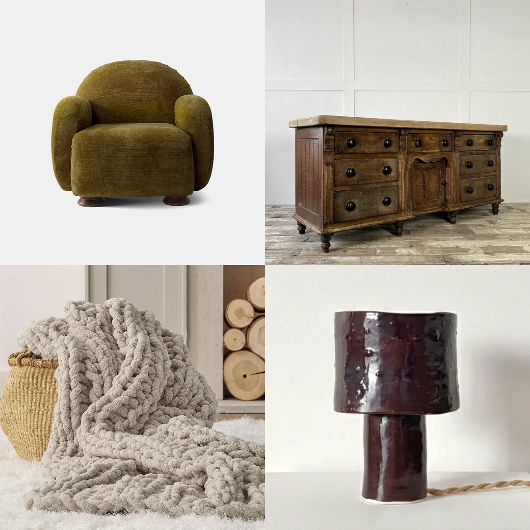
Chunky, simple forms, unadorned; humble, tactile materials; made to enhance material characteristics.
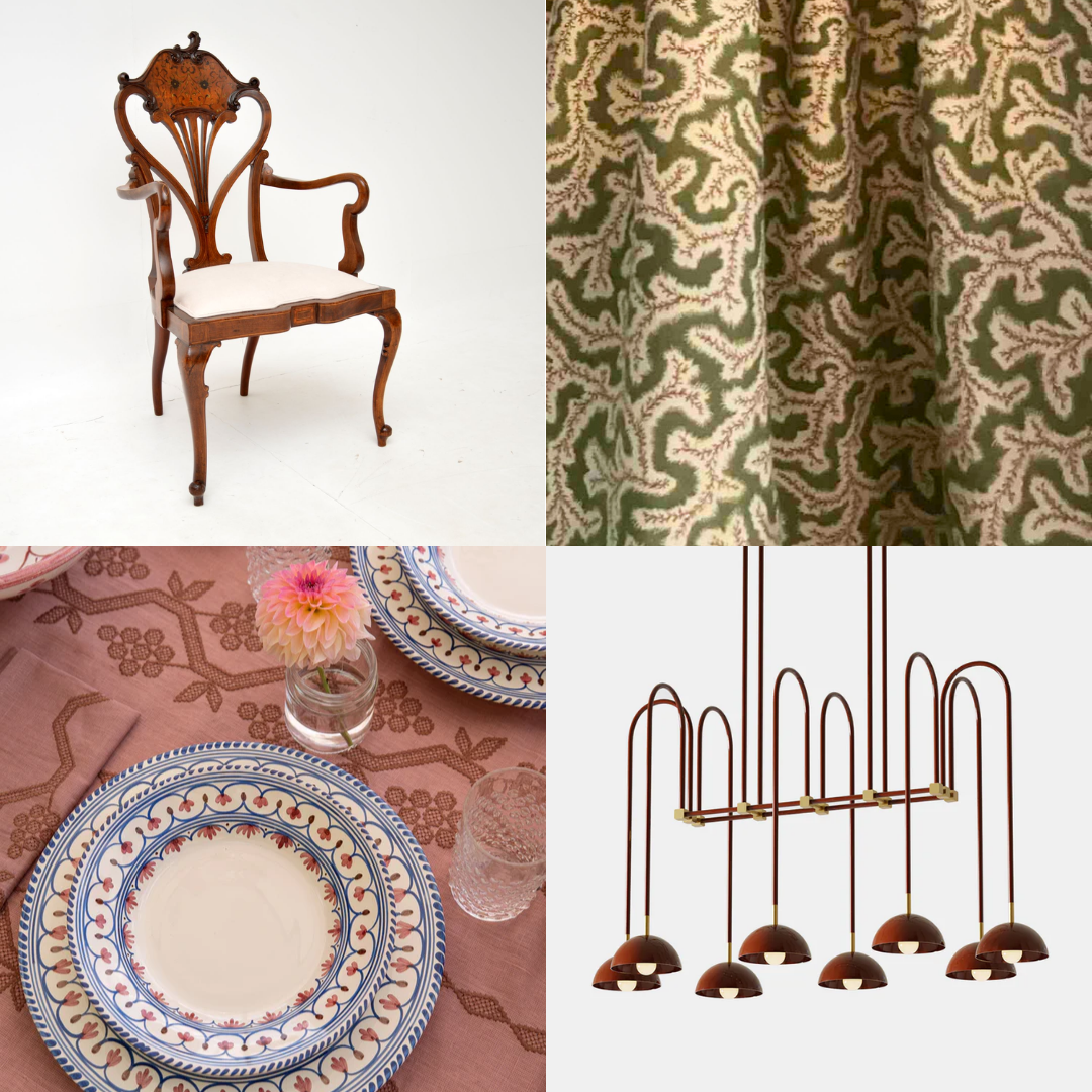
Delicate and elegant forms; smooth, elevated materials; made with precision and attention to detail.
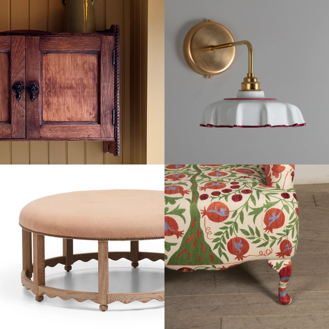
Whimsial, considered details; timeless natural materials; design celebrates crafstmanship.
These are just a few examples; there is no fixed list, nor do things fit neatly into categories. This is largely about feeling and intuition.
Consider your own preferences, particularly if your taste is eclectic – you may find you are consistently drawn to a particular visual language. Naming it, even just for yourself, can help when making decisions, whether buying something new or refining a room.
I often talk about creating tension through contrast in interior design – that one little twist that keeps a scheme feeling fresh and dynamic. Perhaps a note of red within a muted palette, a modern piece within a traditional scheme, or a quirky detail that stops everything feeling too sensible. The visual language, however, remains consistent throughout.
This is what allows a house to feel coherent without becoming predictable. It allows a house to hold complexity – personal, architectural, and practical – without ever feeling forced.